Dash is the de facto open-source dashboards library for Python. Since the start of COVID-19, we’ve seen a tidal wave Dash apps globally that are helping hospitals, governments, investors, and citizens respond to the outbreak.
Here are just a few. If you know of one that should be included, please let us know at @plotlygraphs.
1. COVID-19 Experiments & Compounds (Recursion)
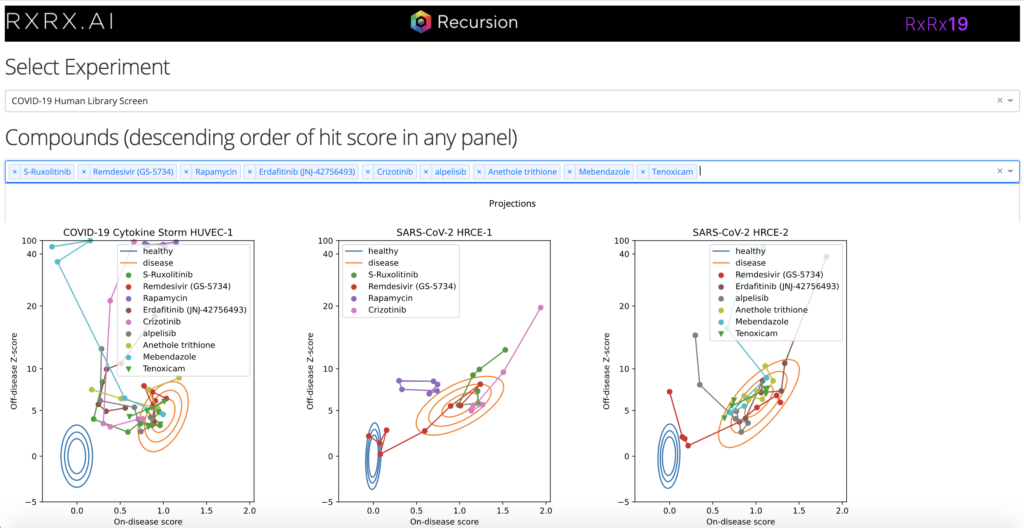
This Dash app uses COVID-19 screening data from >1600 drugs in models of viral infection. It leverages deep-learning embeddings to analyze cellular morphology, develop a scalable phenomics platform, and identify high-dimensional relationships between immunomodulators, toxins, pathogens, genetic perturbations, and molecules.
- Dash app link: https://covid19.rxrx.ai/
- Paper: https://www.biorxiv.org/content/10.1101/2020.08.02.233064v1
- Authors: Recursion Pharma, Imran S. Haque
2. IQT’s COVID-19 Diagnostic Accuracy Dash App
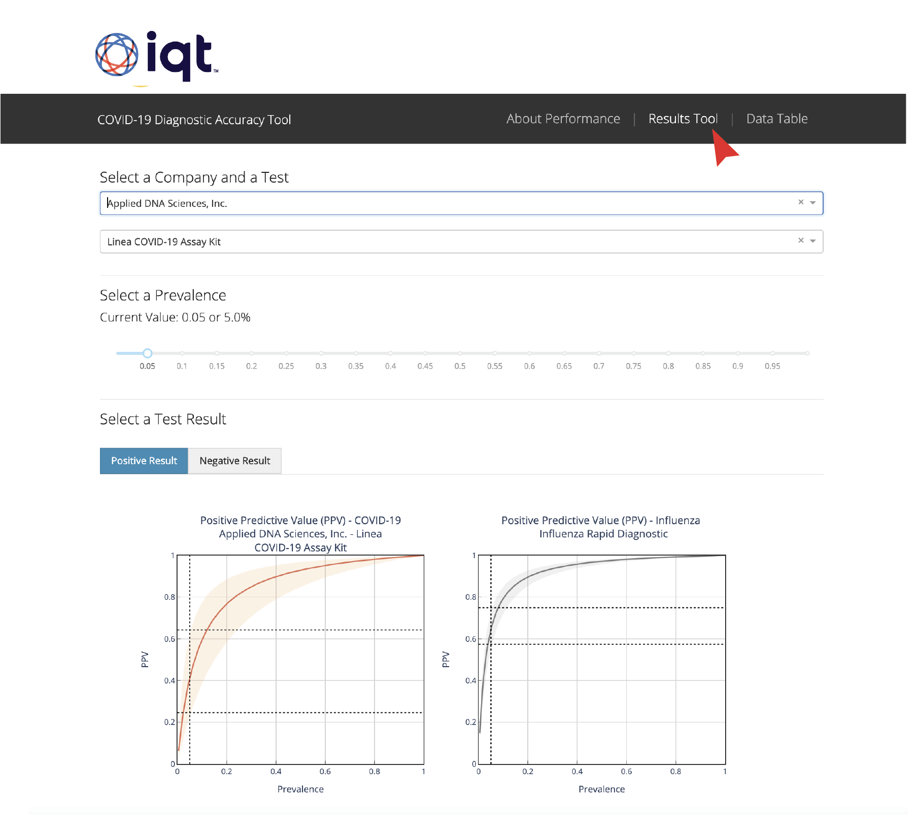
IQT recently released its COVID-19 Diagnostic Accuracy Tool, an interactive web application designed to help people understand and interpret the accuracy of diagnostic tests for the novel coronavirus. This tool, built with Dash, uses interactive data visualizations to present quantitative information about uncertainty in accessible ways.
- Dash app link: https://covid-19-search-diagnostics-db.bnext.org/performance/
- Dash app code: https://github.com/BNext-IQT/covid-test-db
- Article: https://moderndata.plotly.com/why-iqt-made-the-covid-19-diagnostic-accuracy-dash-app/
- Authors: IQT‘s Tommy Jones, Zig Hampel, Ryan Ashley, Kevin O’Connell, Chenny Zhang, Dylan George, Lu Borio, Victoria Chernow, Russ Ross, George Lewis, Andrea Brennen.
3. City of Montréal Dash app
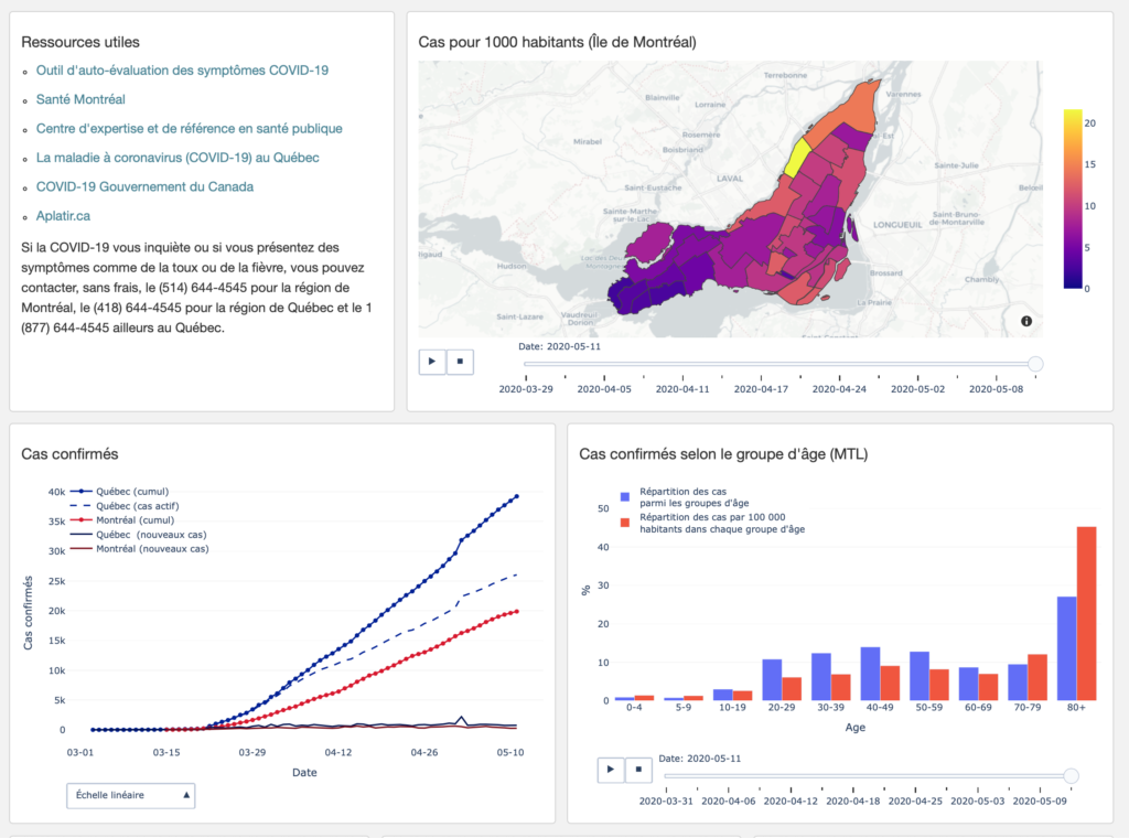
We’re very proud of Mcgill Neuro grad student Jeremy Moreau for creating and publishing this Dash app on COVID-19 cases by neighborhood in our home city. This Dash app is available in both French and English.
- Dash app link: covid19mtl.ca
- Dash app code: https://github.com/jeremymoreau/covid19mtl
- Author: Jeremy Moreau
4. Singapore Government Dash app
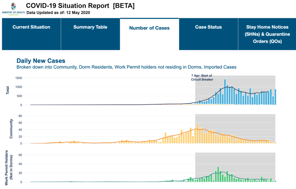
The Singapore Ministry of Health updates this Dash app daily as part of their COVID-19 Situation Report. This easy-to-navigate Dash app makes strong use of the Dash Table and Dash Tabs components.
- Dash app link: https://covidsitrep.moh.gov.sg
- Dash app code: Unpublished
- Author: @sporeMOH
5. Shelter in Place Dash app
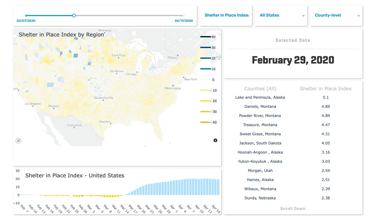
SafeGraph published this beautiful and informative Dash app to showcase their Shelter in Place Index, which tracks the shelter in place behavior of US counties. This Dash app has been presented in Center for Disease Control briefings.
- Dash app link: safegraph.com/dashboard/covid19-shelter-in-place
- Dash app code: Unpublished
- Author: @SafeGraph
6. Clientside Dash app
This COVID-19 Dash app was created by scientific Python luminaries @GaelVaroquaux and @EGouillart. Unlike the other Dash apps in this article, Emma’s and Gael’s Dash app uses Clientside Callbacks for in-browser callback processing. This means that the Dash app does not need a Python, R, or Julia server and can be published on static website platforms like GitHub pages or Netlify. Very cool!
As a core Dash developer, Emma also leads development on Dash’s scientific imaging components. Check out the latest here.
- Dash app link: https://covid19-dash.github.io
- Dash app code: https://github.com/covid19-dash/covid-dashboard/
- Dash app authors: @GaelVaroquaux, @EGouillart, @russpoldrack, @glemaitre58
7. Python Weekly Dash app
This COVID-19 Dash app came onto our radar after being featured in Python Weekly. The author open-sourced the code so that others can easily use this as a template.
- Dash app link: https://covid19-dashboard-online.herokuapp.com
- Dash app code: https://github.com/Unicorndy/covid19_dashboard
- Author: @Unicorndy
8. Julia COVID-19 Dash app
ICYMI, we began offering beta Julia support one month ago for Dash in collaboration with friends at @JuliaComputing.
All other Dash apps in this article were written in Python, but this Dash app is written in Julia, a relatively new scientific computing language that is gaining serious traction.
- Julia Dash app link: https://covid-county-dash3.herokuapp.com
- Julia Dash app code: https://github.com/mbauman/covid19
- Author: @_mbauman
9. Greece COVID-19 visualizations
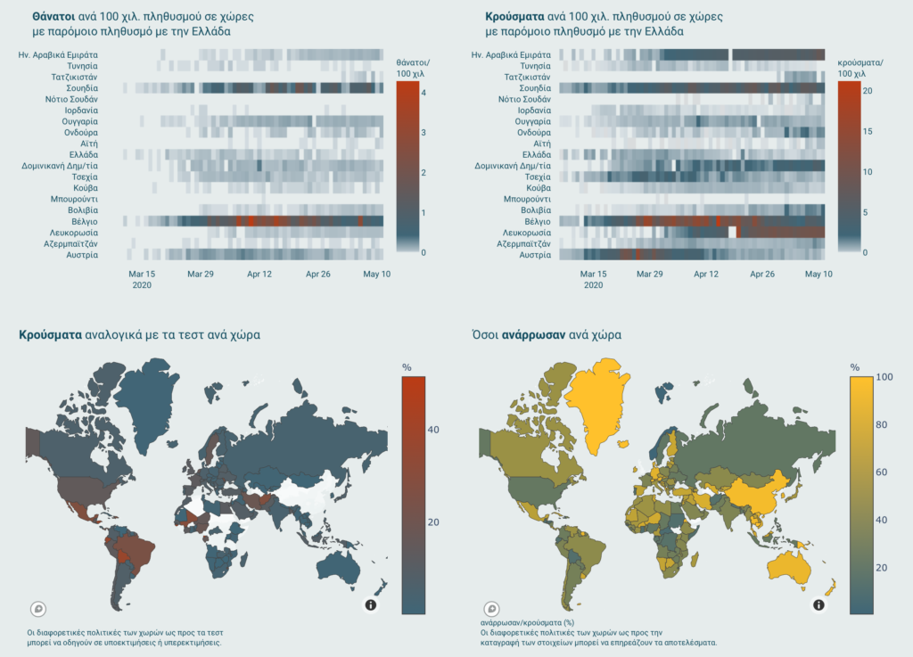
When we first saw this app, we thought it was made with Dash because of the Plotly graphs. On closer inspection, however, we realized it was created the traditional way (a full-stack web app). We’re still including this example because we love the pitch perfect colorway and visualizations by @CVCIO. This is a perfect template and inspiration for any Dash app.
- Visualization link: https://lab.imedd.org/covid19/stats/
- Visualization authors: @mediwatch_io and @iMEdDLab
10. Hospital Capacity Dash app
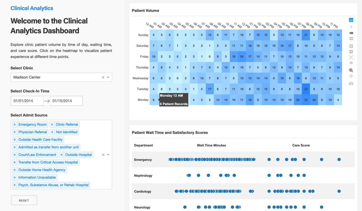
This Dash app template tracks patient volume and wait times by hospital department.
- Dash app link: https://dash-gallery.plotly.host/dash-clinical-analytics/
- Dash app code: https://github.com/…dash-clinical-analytics
- Authors: @plotlygraphs
11. Volunteer Atlas Dash app
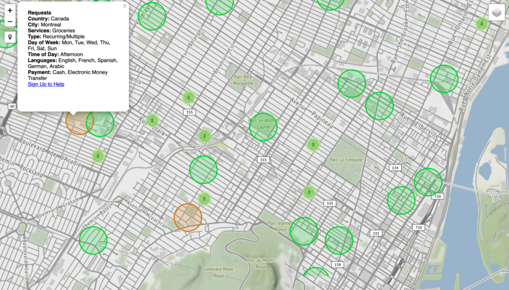
Volunteer Atlas is a nice example of a Dash app that facilities both data input and output. On Volunteer Atlas, local volunteers and individuals in need can anonymously enter their location and information, which is then displayed on a neighborhood map to facilitate local services such as grocery and medicine delivery.
“On the Dev side, I’m using @plotlygraphs’ Dash framework… I feel like I’m standing on the shoulder of giants when I use these tools and there is no way this project could have come together without them.”
– David Yu, author of Volunteer Atlas
- Dash app link: https://www.volunteeratlas.com
- Dash app code: https://github.com/yuorme/volunteeratlas
- Author: @yuorme
12. SIR Model Dash app
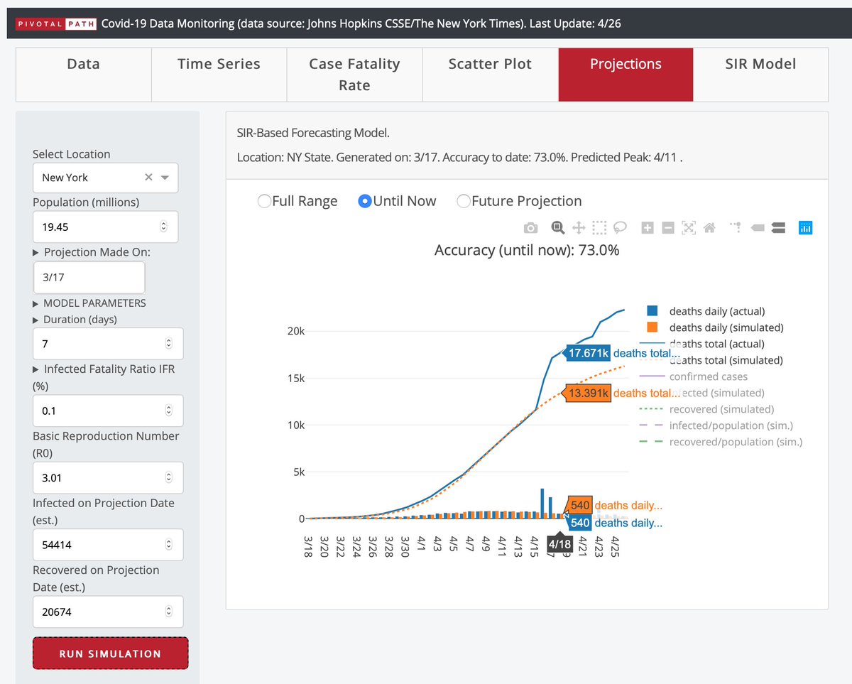
SIR models are a numerical method used by epidemiologists to forecast disease outbreaks. Pivotal Path, a NYC hedge fund research team, wrote a SIR model simulation in Python for COVID-19 and published the result as a Dash app. In this Dash app, you can tweak key SIR model parameters and see interactively how they adjust the forecast.
- Dash app link: https://beta.pivotalpath.com/covid19/
- Dash app code: Unpublished (see 17. DELPHI Epidemiological Case Predictions for code to a similar Dash app created at MIT)
- Authors: @pivotalpath
13. Quality Control Dash app for genomic and transcriptomic data
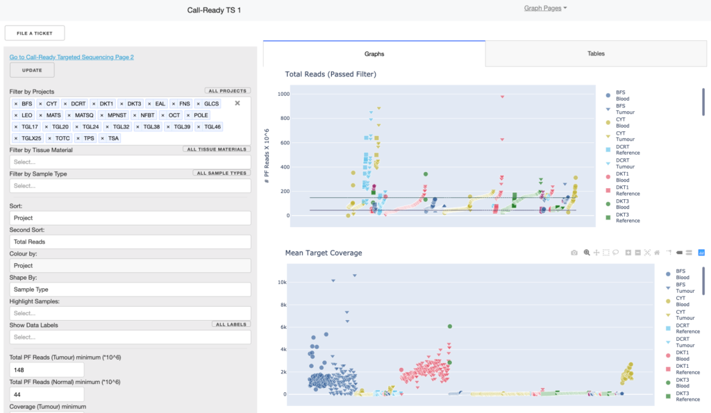
Ontario Institute for Cancer Research (OICR) is a Canadian governmental research lab that have been tasked with developing alternative COVID-19 testing strategies. They are testing and developing four different targeted assays and one whole transcriptome sequencing assay. A critical part of these assays is monitoring quality control and batch effects. OICR has been developing a quality control system ‘Dashi’ for the last year, based on Plotly’s Dash. The project is open-source, available on GitHub, and is currently deployed in production for OICR’s cancer samples.
This same Dashi infrastructure is being used for quality control of alternative COVID-19 testing strategies. With Dash, they are already able to show human and virus genomes alongside each other. They are also able to show metrics that are critical to evaluating whether sequencing experiments have succeeded, and whether they are of high enough quality to detect viral (COVID-19) presence.
- Dash app link: Unpublished
- Dash app code: https://github.com/oicr-gsi/dashi
- Authors: https://github.com/oicr-gsi/…contributors & @OICR_news
14. New York State Dash app
This Dash app is similar to the City of Montréal Dash app at the beginning of this article, but for the state of New York. This Dash app was developed by the Fengqi You Group @ Cornell University.
- Dash app link: http://covid19.cbe.cornell.edu
- Dash app code: https://github.com/PEESEgroup/PEESE-COVID19
- Authors: Fengqi You Group @ Cornell University, @CornellEng
15. The NVIDIA RAPIDS Dash app
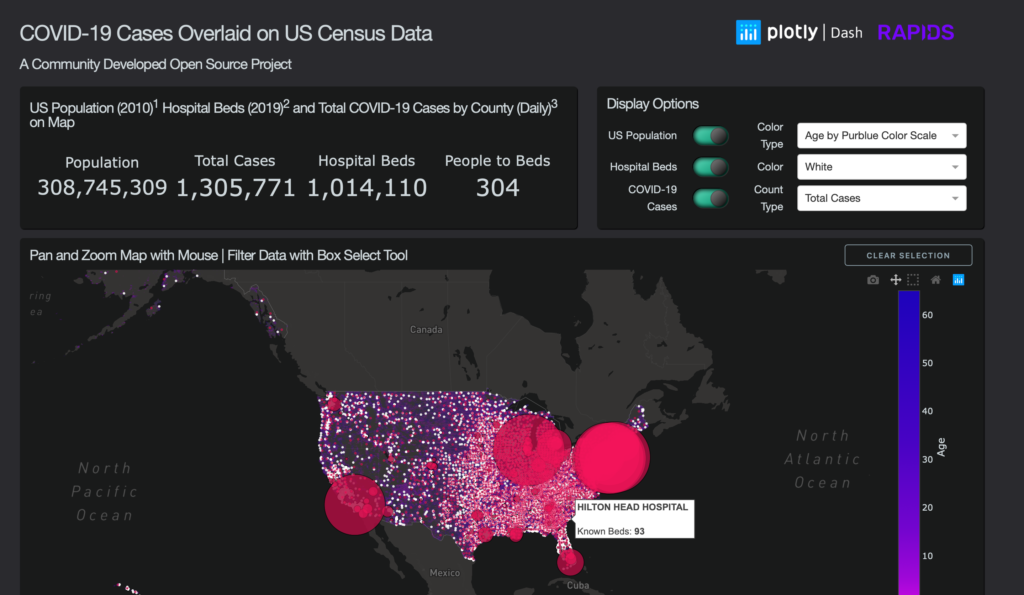
This Dash app has both beauty and brains: Through the NVIDIA RAPIDS library, all of the backend computation occurs in NVIDIA GPU memory. This allows near real-time computation on 300 MILLION ROWS of US census data, all powered through a Dash app user interface (UI). Through UIs like this, Dash and RAPIDS are bringing GPU power to the people!
This Dash app was also featured by NVIDIA’s CEO in his 2020 GTC Keynote.
- Dash app link: https://dash-rapids-covid19.org/
- Dash app code: github.com/…plotly-dash-rapids-census-demo
- Authors: @rapidsai
16. NLP COVID-19 Dash app
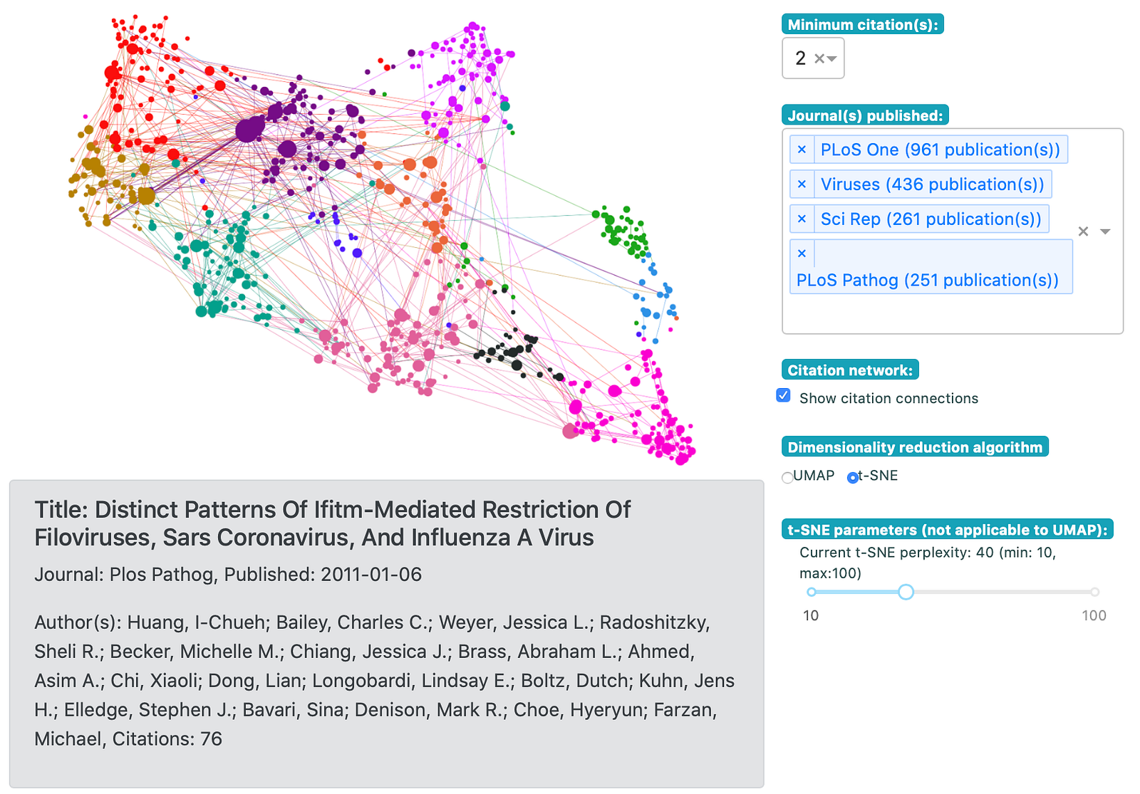
This Dash app mines academic research articles for terms related to COVID-19. You can read more about the implementation in the Medium article.
Globally, hundreds of new research papers and clinical trial tests related to COVID-19 are published daily in every language. This is more information than a team of humans can process, so data scientists like those at Health Canada are processing international results daily to look for trends and clues that could lead to warning signs or treatment breakthroughs.
- Dash app link: https://dash-gallery.plotly.host/dash-cytoscape-lda/
- Dash app code: https://github.com/…dash-cytoscape-lda
- Author: @_jphwang
17. Situational awareness Dash app for cities (CU Boulder)

How can cities know when potentially unsafe gatherings are taking place?
UC Boulder professor Ryan Layer has been answering this question through Facebook user density data and Dash. Ryan’s Dash app provides social distancing situational awareness to city and county emergency managers and public health officials.
- Dash app link: https://covid19.colorado.edu/boulder/
- Dash app code: https://github.com/ryanlayer/COvid19
- Author: @ryanlayer
18. US Unemployment Dash app (FRED data)
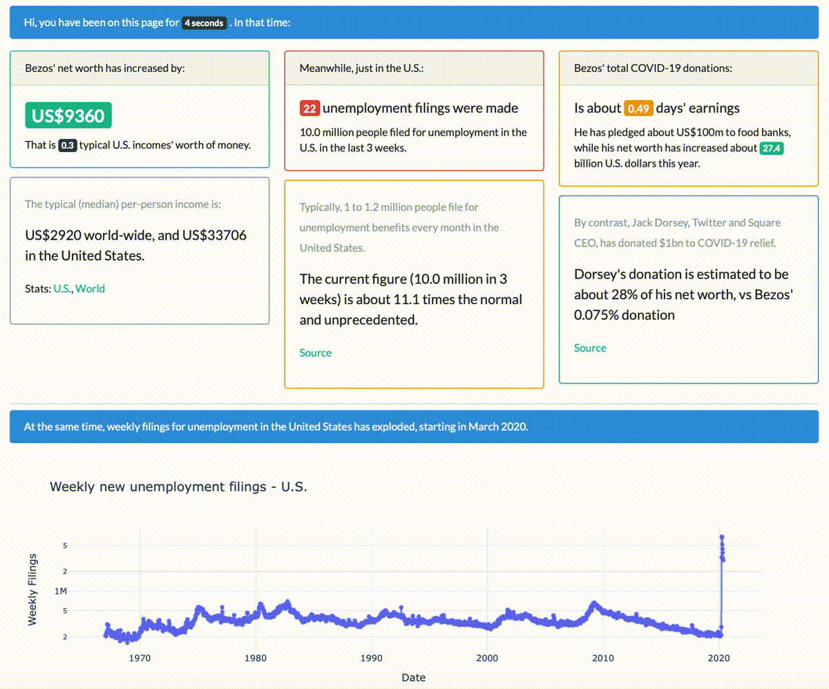
This Dash app uses the FRED API in Python (Federal Reserve Economic Data) to plot unemployment filings in realtime and juxtapose with other real-time, savory statistics like Jeff Bezo’s net worth.
- Dash app link: Not published
- Dash app code: https://github.com/databyjp/dash_bezos_tracker
- Author: @_jphwang
19. DELPHI Epidemiological Case Predictions Dash app (MIT)
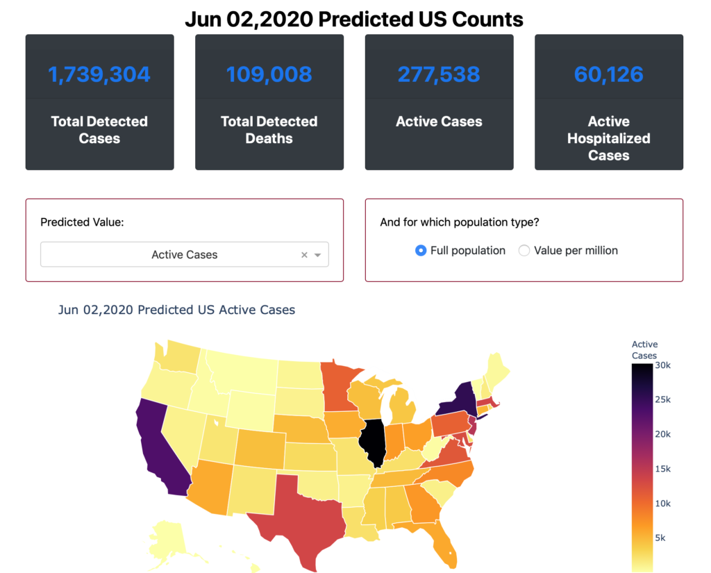
From the project website, “A critical tool for COVID-19 planning is charting out the progression of the pandemic across the United States and the world. We’ve developed a new epidemiological model called DELPHI, which forecasts infections, hospitalizations, and deaths. You can think of our model as a standard SEIR model with additional features specific to the COVID-19 pandemic, like under-detection and differentiated government intervention.”
- Dash app link: https://www.covidanalytics.io/projections
- Dash app code: https://github.com/COVIDAnalytics/DELPHI
- Authors: @covid_analytics @dbertsim
20. The COVID-19 Modeling Consortium (UT Austin)
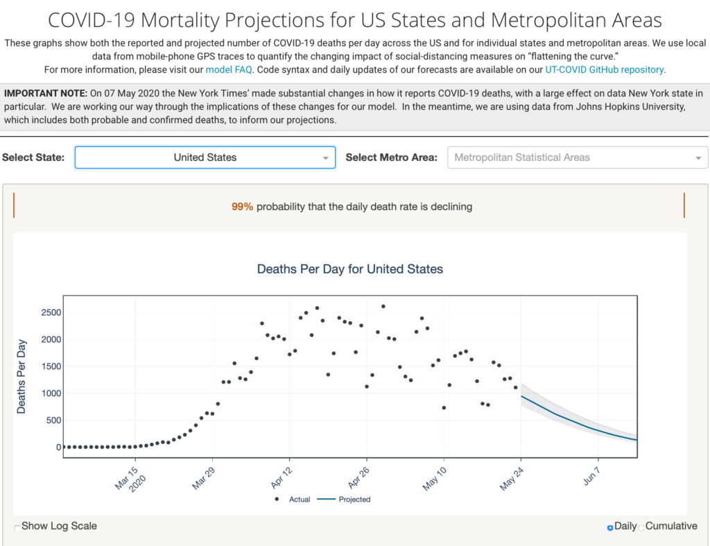
From the project website, “These graphs show both the reported and projected number of COVID-19 deaths per day across the US and for individual states and metropolitan areas. We use local data from mobile-phone GPS traces to quantify the changing impact of social-distancing measures on ‘flattening the curve.'”
- Dash app link: https://covid-19.tacc.utexas.edu/projections/
- Dash app code: https://github.com/UT-Covid/USmortality
- Authors: https://covid-19.tacc.utexas.edu